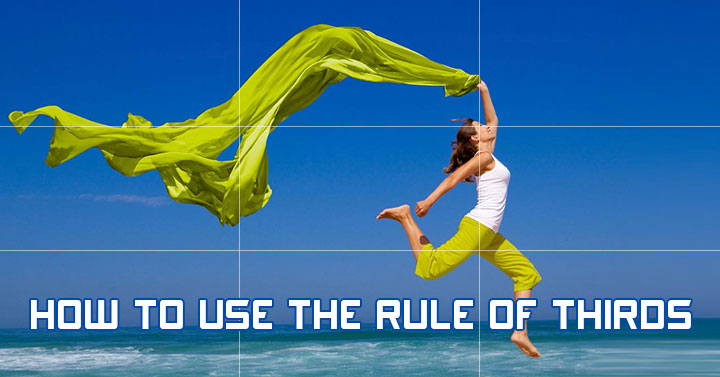
Using the Rule of Thirds?
Diving into the world of photography and design can seem daunting, especially when you’re bombarded with terms like “rule of thirds.”
But hang tight, because it will be a game-changer – once you uncover its secrets.
Imagine your designs transformed, your photos more balanced, and your posts visually compelling, all thanks to understanding and applying this simple yet powerful principle.
So, ready to immerse yourself? Let’s decode the rule of thirds together!

What is the Rule of Thirds?
The rule of thirds is a fundamental design principle that divides an image into a 3×3 grid. Imagine tic-tac-toe!
The idea is to place the essential elements of your visual at the intersections of these grid lines. It’s a technique widely used in photography and design to create well-balanced and visually-appealing compositions.
By following this rule, your designs will draw your reader’s eyes to the most critical parts of your image, elevating the overall aesthetic of your content.


Who Invented the Rule of Thirds?
The rule of thirds isn’t a new-age concept. Its roots stretch back to the 18th century, credited to John Thomas Smith, an English painter who referenced it in his book Remarks on Rural Scenery.
Smith highlighted the balance achieved when the sky occupies one-third and the earth two-thirds of an image, or vice versa.
This principle wasn’t solely confined to the canvas; it was warmly embraced by photographers and designers alike, transcending time and technology.
Today, it’s a foundational cornerstone in the realm of digital design, from creating eye-catching blog banners to impactful social media graphics.
The rule of thirds continues to be a guiding light, helping you create images that engage and captivate your audience.


Why Is the Rule of Thirds Important?
The rule of thirds brings a distinct advantage to your designs: it fosters a natural flow that guides your audience’s eyes around the image. Without it, your designs might appear static and uninteresting.
By strategically placing your focal points along the intersections of the grid, you create a dynamic composition that naturally draws the viewer’s attention.
Plus, the rule of thirds helps establish a clear visual hierarchy in your design. It allows you to prioritize elements based on their importance, creating a sense of balance and proportion.
This makes it easier for your audience to absorb and engage with your content.
How to Use the Rule of Thirds in Design
There are a few simple steps to using the rule of thirds in your designs.
Understanding the Grid System
The grid system is at the heart of the rule of thirds. Here’s a quick breakdown of how it works. Then we’ll dive into examples!
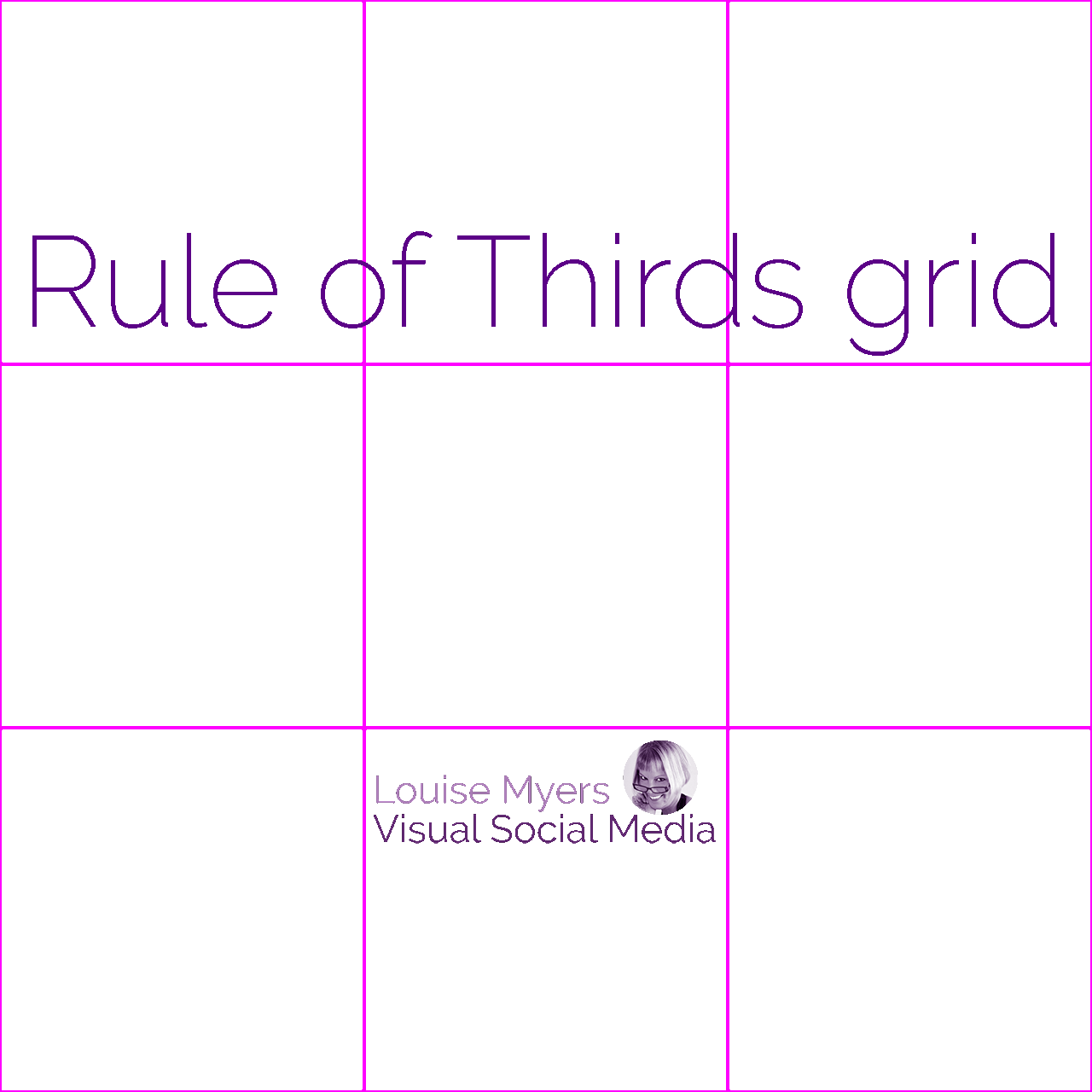

Visualize the Grid
Divide your image or design space into nine equal sections. You do this by drawing two equally spaced horizontal lines and two equally spaced vertical lines. The result should look like a tic-tac-toe grid placed over your image.
Identify the Intersections
You’ll notice that the lines intersect at four points. These are your “sweet spots,” where you should aim to place the most essential elements of your design.
Align Elements
Position key components of your design on the lines and intersections themselves. This could mean aligning the horizon of a landscape along one of the horizontal lines or placing a subject’s eyes at one of the intersections.
Use the Grid to Balance
Lastly, use this grid layout to balance other elements in your design. You can use vertical and horizontal lines as guides to create symmetry or contrast in your format.
Remember, the rule of thirds isn’t rigid. It’s a guideline to help improve your designs, but sometimes breaking the rule can lead to equally compelling compositions.
Balancing Negative Space
When utilizing the rule of thirds in your design, paying attention to the balance of negative space is crucial.
By carefully considering and strategically placing empty areas, you can further emphasize your focal points and create a harmonious composition.
This deliberate use of negative space not only enhances the overall aesthetic appeal, but also adds a sense of tranquility and visual balance to your design.
Rule of Thirds Examples in Photography
Here’s a great way to visualize how to use the rule of thirds. If you love to take photos or post on Instagram, listen up!
Photography can definitely benefit from the rule of thirds, whether it’s a landscape, portrait, architecture, or action image. A strong image is about composition, so at its heart, the rule of thirds is a way to design your photo so it’s visually compelling.
There are a few points to consider for each type of image.
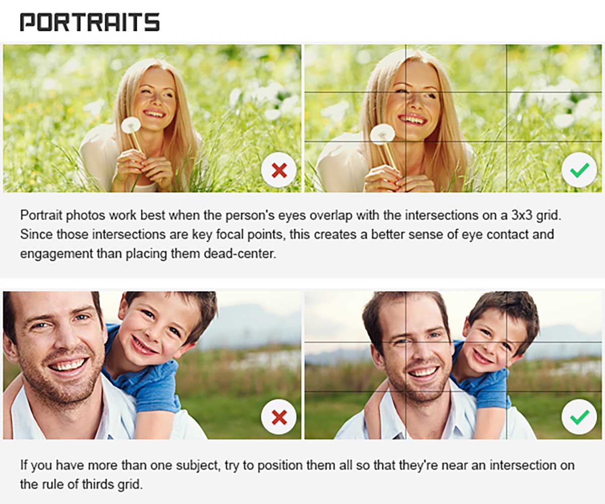

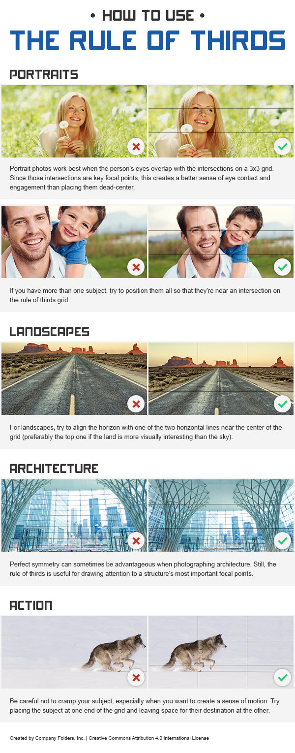
Rule of thirds for portraits
Instead of centering your subjects for portraits, consider putting them at one of the intersections on the grid. Making your subject’s eyes a focal point creates a better sense of engagement with the viewers and the subject.
Since those intersections are key focal points, this creates a better sense of eye contact and engagement than placing them dead-center.
If you have more than one subject, try to position them all so that they’re near an intersection on the rule of thirds grid.

Rule of thirds for landscapes
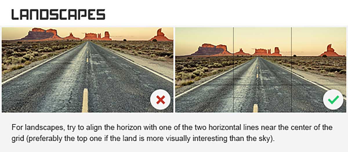
The rule of thirds grid is also great for helping set up shots for landscapes and architecture, as it helps make images more visually appealing by drawing attention to the most important points.
For landscapes, try to align the horizon with one of the two horizontal lines near the center of the grid – preferably the top one if the land is more visually interesting than the sky.
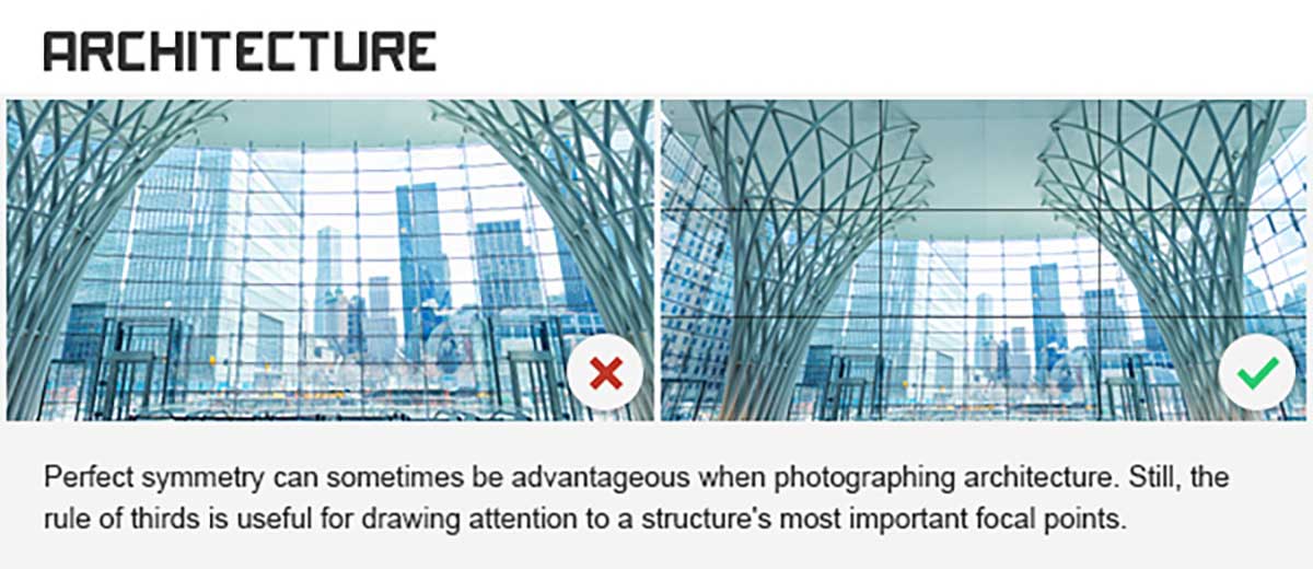

Rule of thirds in architecture
Perfect symmetry can sometimes be advantageous when photographing architecture. Still, the rule of thirds is useful for drawing attention to a structure’s most important focal points.
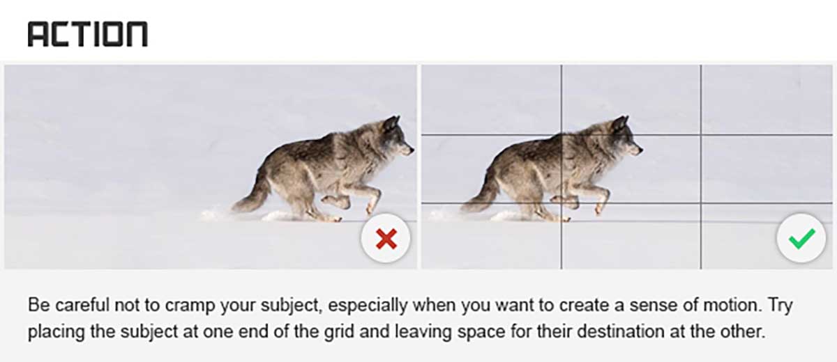
Rule of thirds in action photos
To create action or movement, put your subjects on one side of the grid aimed at the other side. This implies that they will move towards the negative space.
Be careful not to cramp your subject, especially when you want to create a sense of motion. Try placing the subject at one end of the grid and leaving space for their destination at the other.
If used properly, the rule of thirds will create balance without creating too much symmetry, which can make a design or image boring.

Images used at request of Company Folders. Full infographic can be seen at the end of this article. Under CC4.0 license, I’ve cut into segments above.
Benefits of Using the Rule of Thirds in Design
Why use the rule of thirds at all, though? Here are some solid benefits to using this system when designing anything.
Creating Visual Interest
One of the significant benefits of the rule of thirds is its ability to create visual interest.
You make the design more intriguing and engaging by aligning your design elements along the grid lines or at the intersections.
This strategic placement captivates the viewer’s attention, making your designs stand out from the crowd.
Enhancing Composition
The rule of thirds also improves the overall composition of your design.
Instead of placing your subject in the center, which can make the design seem static or dull, using the rule of thirds leads to a well-balanced and cohesive composition.
It introduces a sense of dynamism and energy, giving your design an aesthetic appeal that’s hard to overlook.
Guiding Viewer’s Eye
This design principle is all about guiding your viewer’s eye.
The rule of thirds creates a natural path for the eye to follow, leading to the most important parts of your design.
By placing your focal points at the intersections of the grid, you effectively command the viewer’s attention where you want it.
Basically, it allows you to control the narrative of your design.
Increasing Engagement
Lastly, the rule of thirds plays a pivotal role in boosting engagement.
A visually balanced and interesting design is more likely to captivate your audience and hold their attention.
This can increase click-through rates, more shares, and better engagement with your content.
If you aim to create designs that resonate with your audience and drive engagement, the rule of thirds should definitely be in your design toolbox!
Common Mistakes to Avoid When Using the Rule of Thirds
The rule of thirds is relatively easy to use, but there are a few common mistakes to watch for and avoid.
Overusing the Rule of Thirds
While the rule of thirds is a versatile tool that can significantly improve your designs, it should not be used in every single design situation.
Overusing the rule can lead to predictability and diminish its effect on your audience. After all, it’s the unexpected that often catches our attention.
So, while it’s important to understand and apply the rule of thirds, it’s equally essential to know when to break it to create unique and compelling visuals.
Ignoring Other Composition Techniques
Focusing too heavily on the rule of thirds can sometimes lead you to overlook other composition techniques that enhance your design equally.
Techniques like symmetry, balance, and contrast are crucial in crafting an appealing composition.
It’s important to remember that the rule of thirds is just one tool in a designer’s toolkit and shouldn’t overshadow the use of other valuable design techniques.
Not Adjusting for Different Mediums
The rule of thirds works remarkably well in many scenarios, but it’s not a one-size-fits-all solution.
Different mediums may require adjustments to the rule. For instance, if you’re creating a design for a billboard, you might need to prioritize visibility and legibility over strict adherence to the rule of thirds.
Likewise, a design for a mobile screen will likely have different considerations than a design for a desktop.
So, always consider the medium and adjust your use of the rule accordingly.
Poor Use of the Rule of Thirds
The rule of thirds is only effective when used correctly.
Poor implementation, such as haphazardly placing elements on the grid without considering balance and proportion, can lead to a messy or confusing design.
Always contemplate how your design elements interact with each other and the overall composition.
Remember, the goal of using the rule of thirds is to create a design that guides your viewer’s attention effortlessly to your focal points.
Using the Rule of Thirds to Improve Design
The rule of thirds is a powerful tool that can significantly enhance your design skills.
Understanding and implementing this rule can help create visually compelling designs that captivate your audience’s attention. And also guide their eyes through the narrative of your design.
Remember, it’s not about rigidly adhering to the rule but knowing when to apply it and break away for creativity’s sake.
With a good grasp of this fundamental principle and a discerning eye, you’re well on your way to creating captivating, well-balanced designs.

Random boy says
Tthanks for the easy to understand tips, madam. I really glad found your blog before starting massive visual branding for my small business.
Louise Myers says
You’re welcome!
Drewry says
I do need help I have to admit on getting a quality custom built WordPress theme for my positive affirmations blog. Hopefully someone or you can help me out with that. Your thoughts on this? 🙂
Louise Myers says
Hi Drewry,
I don’t work with any WP custom coders so I don’t know.